반응형
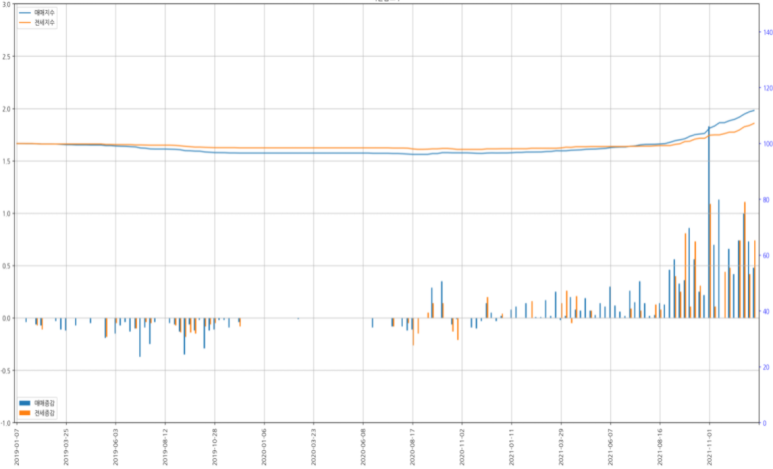
여러 종류의 데이터를 하나의 그래프에 시각화 하는 경우, y축 스케일이 다른 경우 아래와 같이 그래프가 겹쳐서 보입니다.

이렇게 시각화 해도 별 문제는 없지만, 보기에 안 예쁘잖아요?
이런 경우 twinx라는 것을 사용해서 해결할 수 있습니다.
matplotlib.axes.Axes.twinx — Matplotlib 3.5.1 documentation
The newly created Axes instance
matplotlib.org
원리는, twinx를 사용해서 x축을 공유하는 새로운 축을 만든 후 그곳에 두 번째 그래프를 출력하는 겁니다.
ax = df_plot_bar.plot.bar(x='구분', title=city, xlabel="", figsize=(20, 10), ylim=[-1, 3], grid=True, mark_right=True)
total_len = len(df_plot_bar.index)
ax.set_xticks(np.arange(0, total_len + 1, 10))

df_plot_line.plot(x='구분', ax=ax, use_index=False, secondary_y=True, mark_right=True)
plt.tight_layout()
plt.show()
위 코드는 첫번짹 그림의 결과물을 만든 코드 입니다.
df_plot_line.plot 에 보면 ax 파라미터에 df_plot_bar.plot.bar 함수의 리턴 값을 사용하고 있습니다.
이 코드를 twinx를 사용하도록 변경해 보겠습니다.
ax = df_plot_bar.plot.bar(x='구분', title=city, xlabel="", figsize=(20, 10), ylim=[-1, 3], grid=True, mark_right=True)
plt.legend(loc='lower left')
total_len = len(df_plot_bar.index)
ax.set_xticks(np.arange(0, total_len + 1, 10))

ax2 = ax.twinx()
ax2.tick_params('y', colors='blue')

df_plot_line.plot(x='구분', ax=ax2, use_index=False, ylim=[0, 150], mark_right=True)
plt.legend(loc='upper left')
plt.tight_layout()
plt.show()
이번에는 df_plot_line.plot 의 ax 파라미터에 twinx로 새로 만든 축 ax2를 사용했습니다.
이렇게 시각화 하는것이 좀 더 보기 좋은 것 같습니다.
Plots with different scales — Matplotlib 3.5.1 documentation
Note Click here to download the full example code
matplotlib.org
반응형
'PYTHON' 카테고리의 다른 글
| [selenium] 네이버 밴드 게시글 댓글 크롤링. (1) | 2022.09.06 |
|---|---|
| [selenium] shadowRoot 접근하는 방법 (0) | 2022.02.08 |
| [pandas] 그래프 x축 날짜 간격이 너무 촘촘한 경우. (0) | 2022.01.21 |
| [PySide6] 파이썬 UI 프로그램 시작하기(2) (0) | 2022.01.21 |
| [PySide6] 파이썬 UI 프로그램 시작하기(1) (0) | 2022.01.21 |


